Bungukan Kobayashi Clematis
Ink Review #96

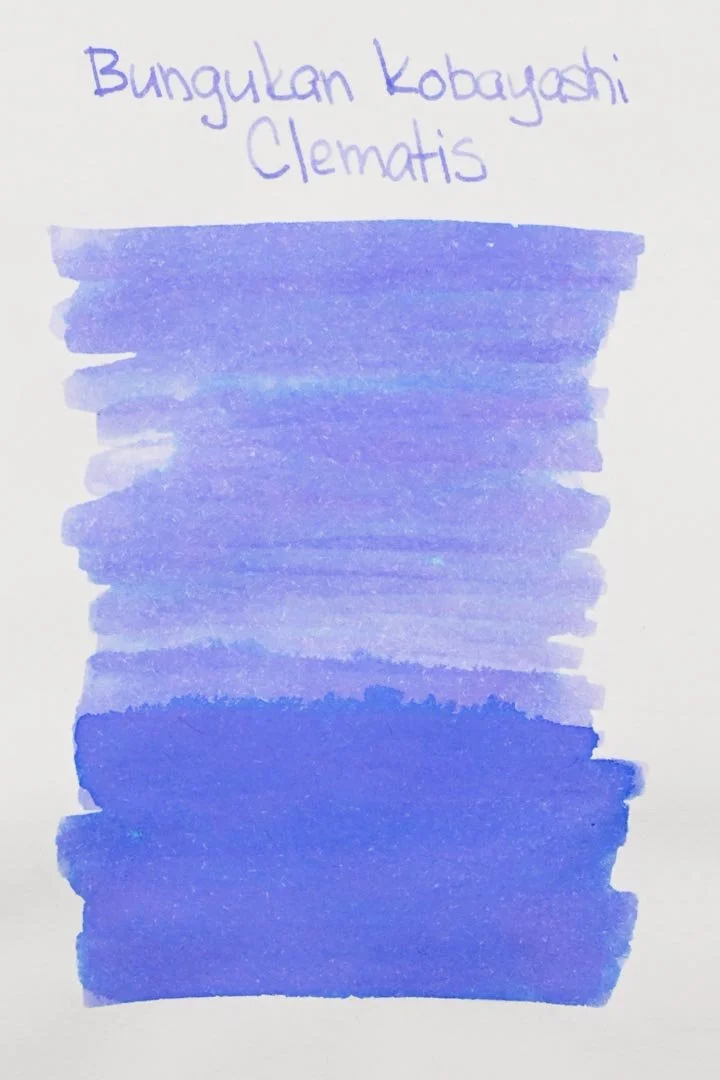
*Please note that the scan is the accurate representation of this color.
Overview
The color/properties:
Clematis is a multi-shading ink. It’s a bright and floral blurple that offers immense shading characteristics. The paper that you choose to use this on seems to play a big role in whether the ink comes out more blue or more pink (more ink-resistant papers such as Tomoe River or Midori MD seem to bring out the pink tones). The ink also seems to take on a more pink appearance when laid down heavily (like the swatches and ink splats/droplets). I also noticed that when first uncapping the pen the ink would come out very blue for the first few letters (visible with the medium nib on Midori). But as mentioned earlier, the shading is phenomenal, no matter what paper you try it on. You can expect to see anything from a light periwinkle to a bright violet, and anywhere in between, often with hard, dark edges around pooled areas of the writing.
It’s also a Sailor-made ink, so it has the iconic Sailor ink smell.
Ink Splat
Ink Droplets


Performance on paper:
Clematis should be fine on most fountain pen-friendly papers. There was minor bleeding on the Kokuyo paper, but truly minor, and mostly limited to the larger nib sizes. There weren’t any signs of bleeding or feathering on the other pages. The dry times were good and rarely took longer than 15 seconds, regardless of nib size. On Rhodia especially, the dry times were notably low. While the water resistance isn’t great, there was at least some. It washes most of the color away, and I don’t think it would hold up to extended water exposure, but if you can get to it fast enough, there might be some legibility left.


Written on Leuchtturm1917 paper, this is the grey color the ink takes on when written on most papers.
This was written on Midori MD paper, bringing out more of the violet tones.
Water resistance
Chromatography
Performance in the pen:
Clematis’ performance is mixed. It has a dry-medium flow, and with the finer nib sizes it was skippy, had hard starts, and was uncomfortable, however, once the ink was flowing through the medium nib sizes and larger, the experience was significantly more enjoyable. It was lubricated enough to be comfortable, and the skipping and hard starting were no longer an issue. Given that these are the nib sizes that get the most out of an ink like this, I think that’s an acceptable compromise. If you like a very wet ink, this ink probably won’t ever cut it, but in comparison to other multi-shaders, it’s not bad. The cleaning process was excellent as well, and there wasn’t any color or residue left in the nib units or barrel of the pen after a single flush.
Performance in a pen: 6.5/10
Performance on paper: 9/10
Color saturation: 4/10
Sheening: 0/10
Shading: 10/10
Dry time: 9/10
Water resistance: 1/10
Ease of cleaning: 10/10
Shimmer: None
My personal thoughts...
Clematis is another Bungukan Kobayashi ink that I was given for review by a friend in my local pen crew. Long story short, it’s a Sailor shop special made for Shizuoka prefecture-based stationery chain Stationer’s Kobayashi, and one of 29 inks inspired by Shizuoka.
Clematis is a flower that comes in literal hundreds of varieties, so for comparison’s sake, I think we can cut it some slack. As I mentioned earlier, it’s a very floral, refreshing, and honestly beautiful ink. When the ink was given to me, I was told that it was similar to Iroshizuku’s Ajisai, and while I think it leans far to the pink side in comparison, that’s still a valid assessment. The color you get out of this ink seems to be highly dependent on the paper and pen you’re choosing to write with, and coming out bluer isn’t just possible, it’s pretty likely. But with Ajisai as the comparison in mind, Clematis is a significantly more complex ink and something I think is beyond a basic comparison. This is an ink that you can have loads of fun experimenting with, and I just wish that I could have more time with it for that. So with all that, I really have no complaints; there’s no question that this is a high-quality ink, but if I did, it would simply be its inaccessibility to anyone outside of the Shizuoka Prefecture. It’s unfortunate, but It would be nice to find a close enough match from Sailor’s international catalog of inks (maybe Nekoyanagi?).
Written in a Leuchtturm1917 notebook with a Pilot Custom 67 (medium)
Written in a Midori MD Notebook with a Pilot Custom 67 (medium)
Compare:


More images/info:
Tools and materials used in the writing samples:
A TWSBI Diamond 580 AL with 7 nib units including a Needlepoint grind, EF, F, M, B, 1.1mm stub, and an Architect grind. All nibs are tuned to perform at the same medium wetness.
A Rhodia No16 A5 DotPad
A Leuchtturm1917 A5 Notebook
A Midori MD A5 Notebook
A 52gsm A5 Tomoe River Notebook
A Maruman Mnemosyne A5 Spiral Notebook
A Kokuyo Campus A5 Notebook