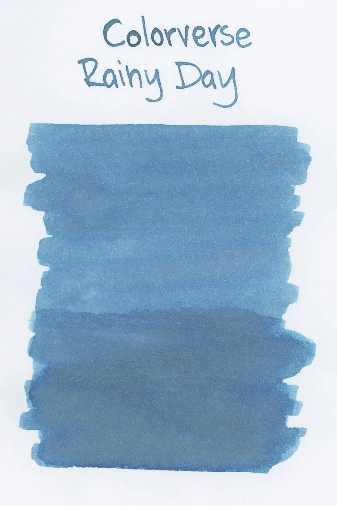
Colorverse Rainy Day
Ink Review #89
*Please note that the scan is the accurate representation of this color.
Overview
The color/properties:
Preface: This color proved to be incredibly difficult to capture accurately. I have done my best to get the most color-accurate scans of this ink possible.
Colorverse Rainy Day is a faded medium blue with prominent grey undertones. There’s a lot of crisp shading between light and dark intensities of the colors wherever the ink pools, as well as hard, dark edges around the letters that are especially noticeable with the larger nib sizes. There are heavy yellow-green tones in the ink splats and droplets, but I don’t suspect that this would ever appear in normal writing.
Ink Splat
Ink Droplets
Rhodia
Leuchtturm1917
Performance on paper:
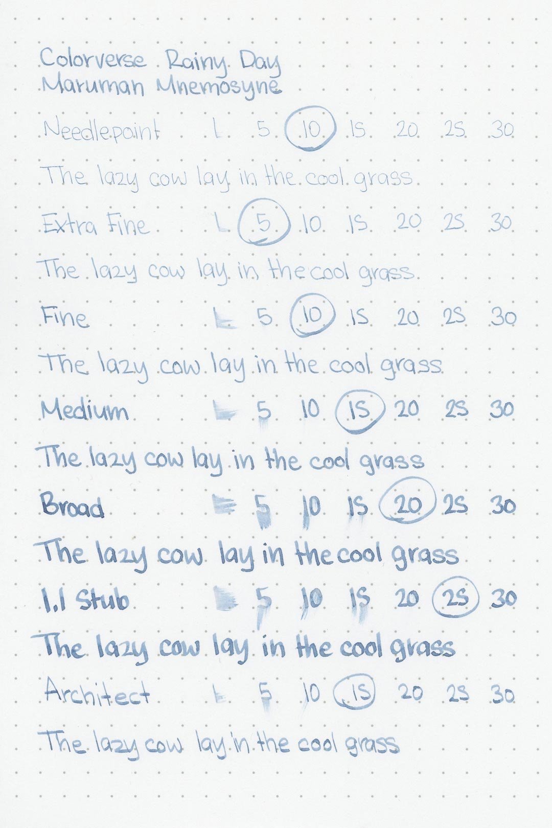
Rainy Day didn’t have a lot of bleed-through on the Kokuyo paper, but it occurred with both the larger and fine nib sizes. It’s more than I would have expected for an ink that’s on the drier side, but there still wasn’t any feathering or bleeding on the other test pages. It should be okay on most fountain pen-friendly papers. The dry times were okay on some papers (Rhodia, Leuchtturm) where the large nib sizes would dry within 15 seconds, but on the others, they would extend as far as 25 seconds. Again, they’re not as good as I had expected for a drier ink, but still just below average. The water resistance wasn’t great, but there are still faint yellow traces of anything written left behind after water exposure.
Midori MD
Maruman
Tomoe River
Kokuyo
Water resistance
Chromatography
Performance in the pen:
Rainy Day has a dry flow, and it led to a lot of dry starts with most of the nib sizes. It was fine while writing but any time I lifted the nib for longer than a few seconds it would lead to another dry start, which became frustrating. The only nibs that didn’t experience this were the stub and architect nibs. I even had trouble using the ink in a number of pens outside of the test nibs. As far as lubrication goes, it wasn’t especially slick, but it was surprisingly smoother than expected. Cleaning only required a simple soak and flush, and there wasn’t any remaining color or residue in the pen or nib units to clean out.
Performance in a pen: 7/10
Performance on paper: 8.5/10
Color saturation: 5/10
Sheening: 0/10
Shading: 6/10
Dry time: 7/10
Water resistance: 2/10
Ease of cleaning: 10/10
Shimmer: None
My personal thoughts...
I love the concept of “Joy in the Ordinary.” It’s not just a fun step away from Colorverse’s usual astronomy-themed releases, but it’s an idea that I can get behind — it’s a core principle that this blog began with in the first place. Although my experience with the ink hasn’t been perfect (and I can’t stress that enough), I’ve still mostly enjoyed my time with Rainy Day. It may not be the most accommodating ink to put in a pen, but what it does get right is the color behind the theme. It’s moody, but I wouldn’t call it gloomy. It reminds me of soft rain clouds and light puddles on the ground; raindrops on my windows diffusing the soft light being cast inside. It reminds me of the days I want to stay inside and read a book or perhaps do nothing at all but enjoy the quiet ambience. It’s a refreshing color for a cozy day and a great sensory element to your next journal entry. I like to think of it as a spring ink, but really, it would be just as fitting in the summer or fall. Just… make sure it works first.
Written in a 52 gsm Tomoe River notebook (print) and 68 gsm Tomoe River pocket notebook (cursive) with a TWSBI Eco (1.1 Stub )
More images/info:
Tools and materials used in the writing samples:
A TWSBI Diamond 580 AL with 7 nib units including a Needlepoint grind, EF, F, M, B, 1.1mm stub, and an Architect grind. All nibs are tuned to perform at the same medium wetness.
A Rhodia No16 A5 DotPad
A Leuchtturm1917 A5 Notebook
A Midori MD A5 Notebook
A 52gsm A5 Tomoe River Notebook
A Maruman Mnemosyne A5 Spiral Notebook
A Kokuyo Campus A5 Notebook


