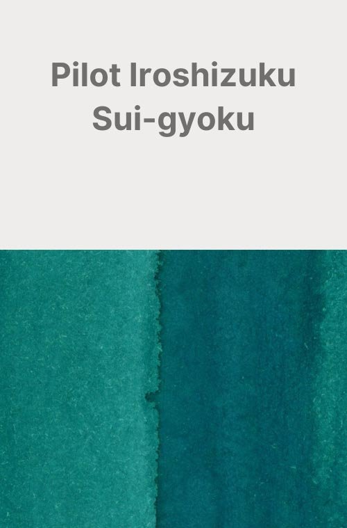
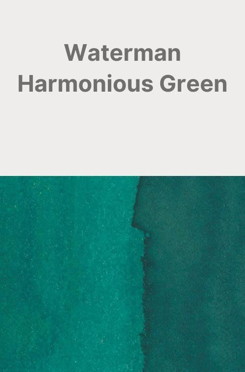
Diamine Aurora Borealis
Ink Review #78


*Please note that the scan is the accurate representation of this color.
This is the 2018 ink of the year made by Diamine for r/fountainpens.
Overview
The color/properties
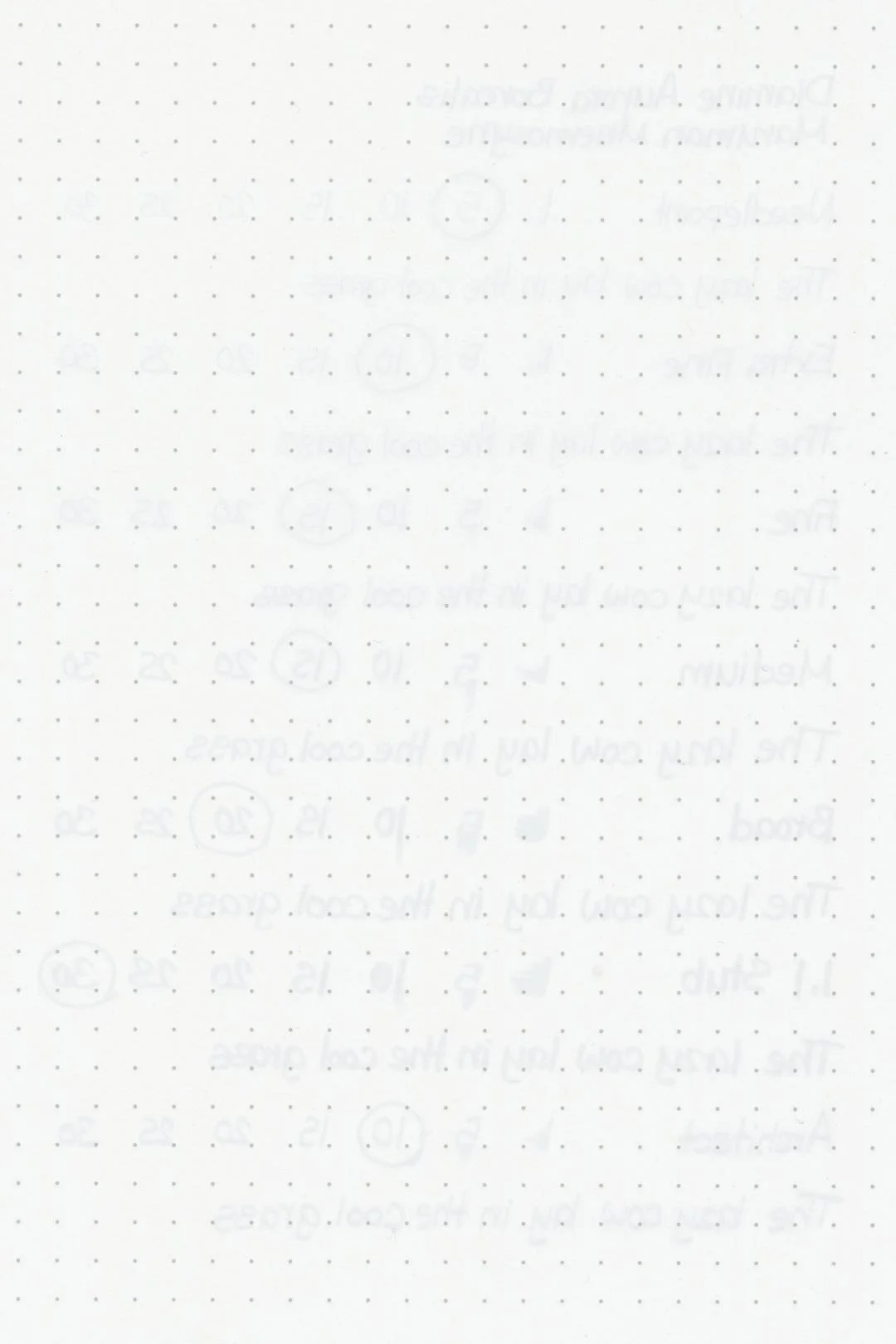
Diamine Aurora Borealis is a deep green with heavy blue undertones. There’s some light shading that presents itself with a soft cut between its lighter and darker tones, as well as a light red sheen that may occasionally appear around the edges of wherever the ink pools. I stress that it’s a minor sheen though, and certainly not something that you might notice with every pen/paper combination. If you want to see sheen with Aurora Borealis, it’s not hard to achieve, but I would recommend sticking to nibs that are larger with a wetter flow.
Ink splat
Ink droplets


Performance on paper:
Aurora Borealis was shockingly good. Other than some minimal bleed-through on Kokuyo, there wasn’t any more bleeding or feathering on the other pages — this ink just doesn’t seem to be all that aggressive to the paper. It should be great on most fountain pen-friendly papers. What was really impressive was the dry times, especially on Rhodia, where it took no more than 10 seconds with every nib size to dry. The rest of the papers also displayed slightly above-average dry times, taking no more than 15 seconds for the larger nib sizes to dry (except for Maruman, where the dry times admittedly suffered). It’s really impressive to see dry times like this for an ink of higher saturation.
Unfortunately, it’s not entirely perfect, and water exposure creates a bit of a mess, but the remains of anything that was written on the paper are still dark enough to be readable.


Water resistance
Chromatography
Performance in the pen:
The performance in the pen was also excellent! It has a medium-wet flow, and while it’s not the slickest ink out there it’s certainly lubricated enough to write comfortably — even the needlepoint felt excellent with this ink. There weren’t any skips or hard starts either (you might notice one hard start with the broad nib on one of the test sheets, but I promise, that was my fault). I can’t imagine running into any headaches while using this ink…at least until it’s time to clean it out. While it didn’t take me more than a few soaks and flushes to get the nibs and pen clean, I would recommend those soaks (if it’s possible to do so). It’s not a bad cleaning experience, but with the ink’s higher saturation, I could see it becoming one if it’s left in the pen for too long without any kind of cleaning.
Performance in a pen: 10/10
Performance on paper: 9/10
Color saturation: 7.5/10
Sheening: 4/10
Shading: 4/10
Dry time: 8/10
Water resistance: 3/10
Ease of cleaning: 7.5/10
Shimmer: None
My Personal Thoughts…
I was originally going to save this review for the winter, but given recent events (May 2024’s geomagnetic storms), what better time than now?
I won’t lie: when this ink was first announced, I was pretty disappointed. It wasn’t the idea behind the color (that was fine), but the color itself left me underwhelmed. I don’t hate the color, but it’s another blue-green-with-red-sheen. We have hundreds of them, and to this day, the color still isn’t something I would say that I’m impressed with. I’m not really sure they hit the mark they were aiming for, either. The red sheen accurately captures (or at least, decently approximates) the bright red or purple colors of the aurora, but the blue-green base is a far cry from the vibrant, almost neon greens that we typically see. I suppose the base color could represent the general night sky with the sheen effect alone representing the aurora, but that seems like a reach.
Regardless, none of that takes away from the fact that this is still an excellent ink. It’s great, and I can’t deny that it’s one of the best-performing inks I’ve tried in this color range. It would be a perfect choice for an everyday ink, especially during the winter.
It would be interesting to see a re-imagining of this theme using shimmers to more accurately portray the colors of the aurora. Diamine actually came very close to this in the 2023 Inkvent calendar with Nightfall, but I’d love to see some other possibilities. Or maybe, hear me out, a dark blue base with chameleon and bright green shimmer.
And on that bombshell, I’m gonna end this review before I get any more crackpot ideas!
Written in a Leuchtturm1917 notebook (print) and a Traveler’s Company passport size Midori MD notebook insert (cursive) with a Taccia Spectrum (14k medium nib)
Comparisons:


More images/info:
Tools and materials used in the writing samples:
A TWSBI Diamond 580 AL with 7 nib units including a Needlepoint grind, EF, F, M, B, 1.1mm stub, and an Architect grind. All nibs are tuned to perform at the same medium wetness.
A Rhodia No16 A5 DotPad
A Leuchtturm1917 A5 Notebook
A Midori MD A5 Notebook
A 68gsm A5 Tomoe River Notebook
A Maruman Mnemosyne A5 Spiral Notebook
A Kokuyo Campus A5 Notebook