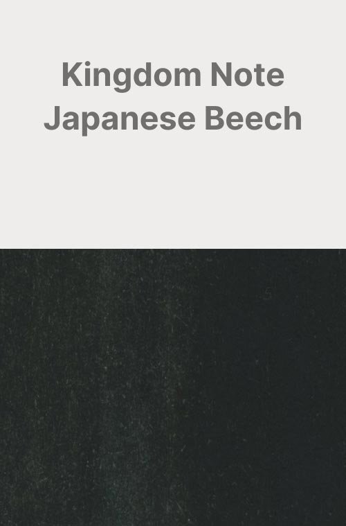
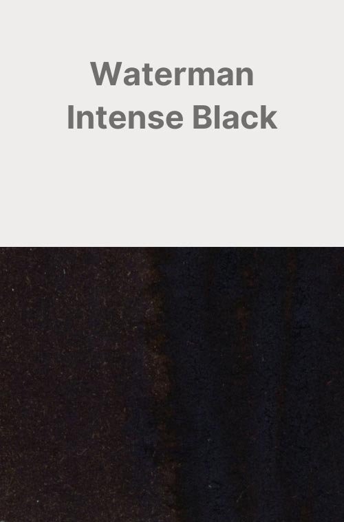
Kingdom Note Japanese Beech
Ink Review #74
*Please note that the scan is the accurate representation of this color.
Overview
The color/properties:
Kingdom Note Japanese Beech is a Black ink. There’s not a lot to say about it, but one thing to note is that the longer I look at it, the more I see a subtle hint of green. Not so much that I’d call it a green-black ink — absolutely not — but it’s there, and you can see it in writing if you look at it long enough. There’s not a lot on the way of shading either. You’ll most likely notice a soft transition between a less saturated smokey black, and a deeper, more dense black. The ink produced a slight black sheen on Tomoe River and Midori MD paper as well, mostly around the areas where the ink pooled at the bottom of letters, but it’s a dull sheen that’s difficult to see in most lighting.
This ink does have the Sailor ink smell, and although I didn’t find it as potent as in some Sailor inks, it’s still there and you can smell it while writing, love it or hate it.
Ink Splat
Ink Droplets
Rhodia
Leuchtturm1917
Performance on paper:
While this ink didn’t feather or bleed through most of the test pages, the bleed-through on Kokuyo was considerably more aggressive than usual. This ink should still be fine on most fountain pen-friendly papers, wetter nibs with this ink may still cause bleeding or feathering with the less ink-resistant papers. The dry times were average, mostly drying within 20 seconds with the large nibs, and one instance on Midori MD paper where it took 30 seconds using the 1.1 Stub.
There was some water resistance, but the ink’s high saturation causes a lot of clouding when exposed to water, and the legibility of anything written will vary.
Midori MD
Maruman
Tomoe River
Kokuyo
Water resistance
Chromatography
Performance in the pen:
Japanese Beech has a wet flow, but despite that, there isn’t a lot in the way of lubrication. It’s not terrible, but for something so wet you would expect it to be a significantly slicker and more pleasant writing experience than it is. I also ran into a lot of hard starting while writing with the fine, medium, broad, and stub nibs. The Architect worked fine, but the opposite side of the nib that I use to circle the dry times didn’t want to work with this ink at all. For such a wet ink you would expect there to be better performance.
Cleaning was easy, only requiring a flush and soak to run clear, with no color, residue, or staining on the inside of the pen. While cleaning was easy during my tests, the high saturation could make this ink significantly more difficult to clean out if left in a pen for too long.
Performance in a pen: 7/10
Performance on paper: 7/10
Color saturation: 8/10
Sheening: 0/10
Shading: 2/10
Dry time: 6/10
Water resistance: 3/10
Ease of cleaning: 8/10
Shimmer: None
My personal thoughts...
Like my last ink review, this ink was also given to me for review by someone in my local pen group who brought it over from Japan. However, the origins of this particular ink aren’t quite as big of a mystery: It’s a Sailor ink made for Kingdom Note — a Tokyo-based stationer in Japan. As for the ink, well, it’s okay. It’s a black ink. The artwork on the bottle gave me the impression that it was going to be a lighter green-grey. I would have liked that. When it comes to black inks, however, there are already a lot of options that do a better job and aren’t so limited in availability. I could try as hard as I can to find some reason to recommend this ink, but really, I can’t. I think it missed its mark.
Written on 52 gsm Tomoe River Paper with a Pilot Custom 74 (Nib Tailor Selvedge Nib)
Compare:
More images/info:
Tools and materials used in the writing samples:
A TWSBI Diamond 580 AL with 7 nib units including a Needlepoint grind, EF, F, M, B, 1.1mm stub, and an Architect grind. All nibs are tuned to perform at the same medium wetness.
A Rhodia No16 A5 DotPad
A Leuchtturm1917 A5 Notebook
A Midori MD A5 Notebook
A 68gsm A5 Tomoe River Notebook
A Maruman Mnemosyne A5 Spiral Notebook
A Kokuyo Campus A5 Notebook


