Kingdom Note Night Curtain
Ink Review #97
*Please note that the scan is the accurate representation of this color.
Overview
The Color and Properties
Kingdom Note Night Curtain is a very dark blue-black ink that has some light shading between midnight blue and black in areas where the ink pools. Looking at the ink on paper, I initially thought I was seeing a lot of purple, but there’s actually a subtle purple/red sheen, and even a light luster that dries over the ink making it appear that way. It’s soft sheen like I mentioned, and while it’s not far off, I still wouldn’t quite call this a full-fledged sheening ink. It’s there, but it’s just too subtle in most lighting. Still, it gives the ink some spice that I think it needs. It’s otherwise difficult to distinguish this ink from a black one unless you’re looking at it in excellent lighting.
Being a Sailor made ink, it has the Sailor ink smell, but for whatever reason, it’s not that strong here, and I barely noticed it while working with this ink.
Ink Splat
Ink Droplets
Chromatography
Performance on Paper | Dry Times | Water Resistance
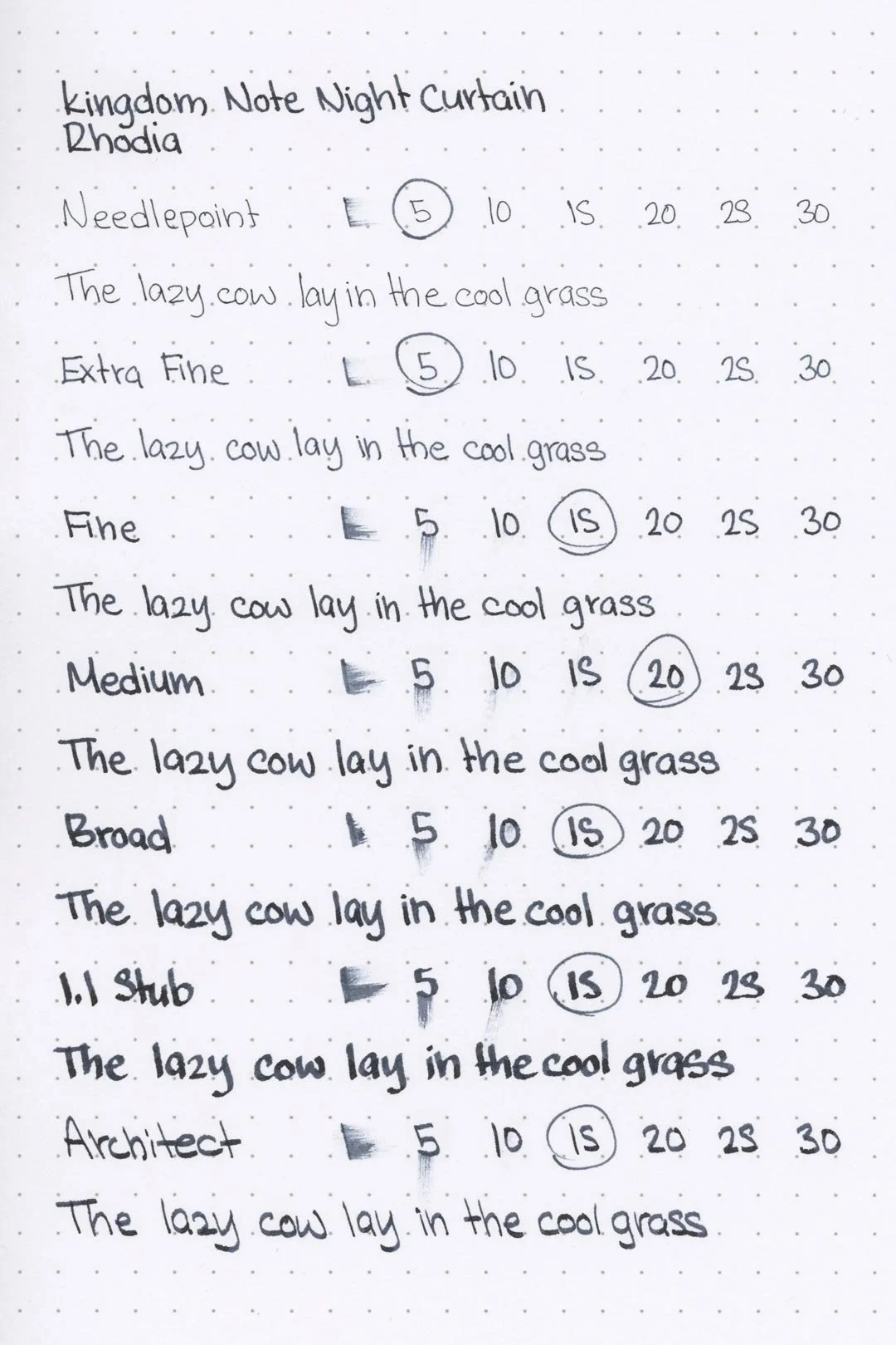
Unfortunately, this wasn’t the best. Almost any ink will have some form of bleeding on Kokuyo (that’s normal), but I also noticed not only feathering but a lot of spot-bleeding on the Leuchtturm paper, to the extent that one spot (visible with the broad nib on the 25-second marker) bled straight through and left a mark on the next page. That’s not great, but of course, Leuchtturm isn’t all that ink-resistant either, so it wasn’t all too shocking. What was shocking was the feathering on the 68gsm Tomoe River paper used for part of the writing sample. That isn’t great. So, there wasn’t any feathering or bleeding on the other papers, but I would make sure to try this on a test page before getting started, just to be safe.
Rhodia
Leuchtturm1917
The dry times weren’t great either: some papers had average dry times, but there were a lot of cases where the ink barely managed to dry in 30 seconds. You might have noticed that the dry times were reasonable on the Leuchtturm paper, but that’s also because it was bleeding through the paper the whole time (that’s also why the dry times are naturally better on Kokuyo).
As for water resistance, it’s alright. There’s some minor clouding when the ink is exposed to water, but the leftovers are dark and crisp enough to maintain legibility.
More Pages
Midori MD
Maruman
Tomoe River
Kokuyo
Performance in the Pen | Cleaning
Night Curtain has a medium flow, but I still had concerns that it would feel dry. I wasn’t entirely incorrect: the lubrication is okay and it’s comfortable, but there was a strange “gritty” feeling, for lack of a better way to describe it. It wasn’t bothersome to me, but I could see this being a massive deal-breaker. Otherwise, the ink behaved well. There weren’t any hard starts or skips (you may notice some in the print writing samples, but this was because of paper lifting off of my writing surface). For me at least, everything was fine.
I was concerned that the ink’s higher saturation would be a problem with cleaning, but it wasn’t. A single soak and flush cleared the pen and nib units from any color or residue, no dark rings, nothing. It was an easy clean overall.
Writing Samples
Performance in a pen: 8/10
Performance on paper: 6/10
Color saturation: 8/10
Sheening: 4/10
Shading: 2/10
Dry time: 6/10
Water resistance: 3/10
Ease of cleaning: 9/10
Shimmer: None
My personal thoughts...
Kingdom Note’s Night Curtain is an interesting ink. There’s not a lot of information that I was able to find on it, but I was at least able to locate Kingdom Note’s product page, and the following excerpt (translated the best I can from Japanese):
-Colors of Time- (Toki no Iro)
“A series that expresses the time of day in Shinjuku, a big city that changes daily, through color.
Even in Shinjuku, which has a large terminal that’s constantly moving,
there are moments of sleep.
This time, we have taken two periods of night as the theme: late night and dawn.”
"Night Curtain (Yoru no Tobari) expresses late night in Shinjuku. The motif is the shadows lit by neon lights and the chaotic streets and sky of Shinjuku, and the color matches the fountain pen released at the same time.”
So, that’s pretty straightforward. The ink is made to represent the late night in Shinjuku, neon lights and all, and I think Night Curtain executes that concept well enough. The soft red sheen does a good job of breaking up the deep blue-black and representing that neon glow. But thinking outside of the theme, I think this is a pretty solid ink. It takes what could have been an underwhelming blue-black that’s almost too dark to be easily distinguishable and gives it some personality. I got a lot of enjoyment out of my time writing with this ink! Would I say it’s worth it? Well, if you’re near or already at a Kingdom Note, sure! Otherwise, probably not. That’s not to diminish Night Curtain as a product — I really do like it, but I think the same effort could be spent on finding a suitable alternative, by Sailor or otherwise.
Written on 52 gsm (cursive) and 68 gsm (print) Tomoe River paper with a Taccia Covenant (Nib Tailor Selvedge Nib)
More images/info:
Tools and materials used in the writing samples:
A TWSBI Diamond 580 AL with 7 nib units, including a Needlepoint grind, EF, F, M, B, 1.1mm stub, and an Architect grind. All nibs are tuned to perform at the same medium wetness.
A Rhodia No16 A5 DotPad
A Leuchtturm1917 A5 Notebook
A Midori MD A5 Notebook
A 52 gsm A5 Tomoe River Notebook
A Maruman Mnemosyne A5 Spiral Notebook
A Kokuyo Campus A5 Notebook


