Wearingeul Jane Eyre
Ink Review #115
*Please note that the scan is the accurate representation of this color.
Overview
The color/properties:
Wearingeul Jane Eyre is a pastel violet with light pink and notably heavy grey undertones. I want to focus on that last point because it sets this color apart: depending on the conditions (be it lighting, the wetness of the pen, the paper, or otherwise), this ink almost appears more grey than violet. It’s difficult to truly capture it in a scan or a photograph, but when you’re looking at it in person, those undertones give it a unique and moody character. The moodiness is further strengthened by the shading that presents itself as a soft, mellow gradient between the ink’s light and dark tones, as well as possible dark edges around the color depending on the wetness of the pen.
Ink Splat
Ink Droplets
Rhodia
Leuchtturm1917
Performance on paper:
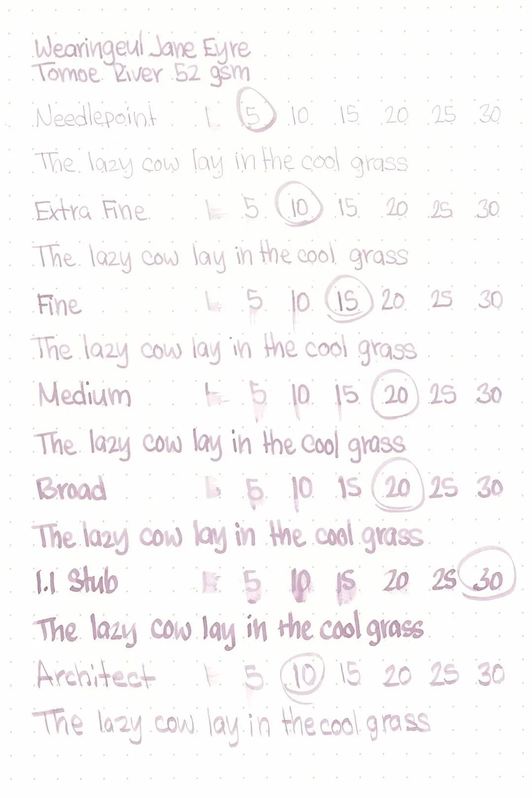
Jane Eyre should be safe on any fountain pen-friendly paper. During my tests, I didn’t experience any bleed-through or feathering (not even on the Kokuyo sheet). The dry times were average, although longer than expected for such a light and unsaturated ink. The large nib sizes mostly dried within 15-20 seconds, and the finer nib sizes mostly dried within 10-15.
The water resistance is good for such a light ink. There’s not a lot of color retention, but there’s very little clouding when the ink is exposed to water and there are crisp and legible grey shadows left behind of anything that was written.
Midori MD
Maruman
Tomoe River
Kokuyo
Water resistance
Chromatography
Performance in the pen:
Wearingeul Jane Eyre has a dry-medium flow, and it can potentially be a comfortable and pleasant writing experience, but it isn’t without issue either. The dry flow is immediately noticeable with the needlepoint: it works but it doesn’t work well and it always feels like it’s on the verge of skipping. The same goes for the extra fine and fine nibs, though to a lesser extent. The medium nib was the sweet spot, and there weren’t any issues. Unfortunately with the broad nib, the dryness led to some light skipping, and worst of all was the 1.1 stub, which had constant hard starts during writing.
Cleaning was easy and the color washed out quickly in a single flush.
Performance in a pen: 6/10
Performance on paper: 10/10
Color saturation: 4/10
Sheening: 0/10
Shading: 4/10
Dry time: 7.5/10
Water resistance: 4/10
Ease of cleaning: 10/10
Shimmer: None
Sarah’s thoughts...
Back in September, Julian shared his thoughts about the Wearingeul ink named after his favorite novel. And today, it’s my turn! Jane Eyre is my all-time favorite novel, which I first read waaay back in 2007, and have read many more times since. Though we’ve missed the anniversary by a few weeks (it was published on October 19th, 1847), the fall season is perfect for this gothic Victorian classic.
I wish I could say the same for the color. We’ve mentioned before that at times, the ink colors that Wearingeul chooses for some of the works in their World Literature series don’t match or reflect the content and themes of the stories in a meaningful way. With so many color-centric themes, symbols, and references available throughout Jane Eyre, it baffles me why they would choose a pale violet to represent the novel. Their marketing copy offers some insight as to their inspiration [Warning: the following contains some mild spoilers for the plot and ending of the novel!]:
“It illustrates the last scene of the novel, the reunion. From the pastel violet, gray color becomes divided.”
On the surface, I can see an easy association between a cheerful violet and a happy reunion between two lovers, which takes place in the early summer. I’m not exactly sure what the “gray color becomes divided” part signifies (and I fully acknowledge that there may be some translation issues involved here) — to my knowledge, there’s nothing in the novel that links either violet or gray to anything in the story. And to be honest, I’m not interested in trying to make this make sense because I’m simply not a fan of the decision to represent this novel with this color.
So what would be an appropriate pairing? Well, as anyone who has read the novel will probably guess, an obvious possibility would be a vivid red. In the very first chapter, the color red appears as a powerful symbol and remains so through the story. Another option that I would suggest — and this might sound crazy, but hear me out — is a red-orange or something similar. A color to represent “fire,” which is a primary motif throughout the novel. A number of important characters, including Jane and Rochester, are known for their passionate natures and are often described in fire-related language (or contrasted by imagery of ice). Fire also shows up several times at key moments in the plot. On the surface, it would probably seem like a mismatch, but I would argue that pastel violet is far too soft and romantic a color for this gothic romance, even if the ending does entail the sublime joy of love and reunion.
Writing sample written on 52 gsm Tomoe River paper with a Franklin Christoph Model 19 (SIG medium nib)
More images/info:
Tools and materials used in the writing samples:
A TWSBI Diamond 580 AL with 7 nib units including a Needlepoint grind, EF, F, M, B, 1.1mm stub, and an Architect grind. All nibs are tuned to perform at the same medium wetness.
A Rhodia No16 A5 DotPad
A Leuchtturm1917 A5 Notebook
A Midori MD A5 Notebook
A 52gsm A5 Tomoe River Notebook
A Maruman Mnemosyne A5 Spiral Notebook
A Kokuyo Campus A5 Notebook


