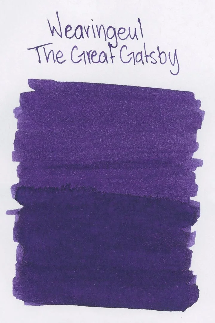
Wearingeul The Great Gatsby
Ink Review #106
*Please note that the scan is the accurate representation of this color.
Overview
The color/properties:
Wearingeul The Great Gatsby is a medium purple with a heavy blue undertone — and I can’t say that enough because, while it is purple in a lot of conditions, it really does look like it might be blue. There’s not a lot of shading, but you might notice some minor variation, especially dark edges around pooled areas of the ink. Wearingeul claims there’s a golden sheen, but I would say that’s a far reach: you might see a minor sheen around the edges of pooled areas as well, but it’s dull and not all that prominent. Perhaps with a wetter pen, but I wouldn’t personally call this a sheening ink.
Ink Splat
Ink Droplets
Rhodia
Leuchtturm1917
Performance on paper:
The Great Gatsby is a fairly gentle ink. Though the bleed-through on the Kokuyo paper was on the heavier side, and prominent across all of the nib sizes, I still didn’t see any bleeding or feathering on the other test pages or the ink splat/droplets. It should be fine on most fountain pen-friendly papers. The dry times were average but still better than I expected, with the large nib sizes mostly drying within 20 seconds and the finer sizes drying in 10-15. There’s some water resistance as well, but although water exposure leaves enough behind to be legible, the color still clouds and that legibility isn’t the best.
Midori MD
Maruman
Tomoe River
Kokuyo
Water resistance
Chromatography
Performance in the pen:
The Great Gatsby has a medium flow that was consistent across all of the nib sizes. It’s not overly slick, but there’s enough lubrication for the writing experience to be comfortable. I didn’t experience any hard starts, stops or skips during my tests, and it was an overall pleasant ink to write with.
The cleaning experience was easy, too. A single soak and flush was all it took to clean the nib units and barrel, though I would highly recommend soaking the nib unit (if possible/safe for the material of the pen) to make the process easier with the more saturated color.
Written on 52 gsm Tomoe River Paper
Written in an Endless Storyboard notebook
Performance in a pen: 10/10
Performance on paper: 8/10
Color saturation: 7/10
Sheening: 1/10
Shading: 4/10
Dry time: 7.5/10
Water resistance: 3/10
Ease of cleaning: 8/10
Shimmer: None
My personal thoughts...
I’ve been looking forward to this review for a long time. The Great Gatsby is my all-time favorite novel and today (September 24th, 2024) is the 128th anniversary of F. Scott Fitzgerald’s birth. I can’t think of a better way to commemorate the occasion!
But I may as well start by addressing the elephant in the room: the color. It may come as no surprise that my first thought upon finding this ink in my hands was “A green would be more appropriate.” I thought maybe it was too critical of an assessment, but then I was told the same thing by someone looking through my swatch book at an event, so perhaps not. But I tried to remain open-minded. As far as Wearingeul’s own inspiration goes, their marketing copy states:
“This ink shows the falling morality and humanity behind a fancy party in the 1920s US.”
Well, alright. That doesn’t really help at all, and I dare to wonder if anyone at Wearingeul has read the book. “Falling morality and humanity”? Perhaps a valid commentary on the old rich vs new rich motif as a whole, but this description feels like a weak assumption of the plot. Despite my initial thoughts, however, I don’t think it’s necessarily a bad color to represent the story — it could indicate a degree of wealth and extravagance depicted in the book (as it does in the Folio Society edition of the novel featured in some of the photos in this review), perhaps with a hint of melancholic undertone to signify the tragically hopeless idealism behind Gatsby’s pursuit. A stronger sheen that leaned more to the green side could have been a brilliant rendering of the green light reflecting off the bay between Gatsby and Daisy’s dock, but I digress. On the whole, the ink is excellent and interpretations aside, I would argue that it’s a fairly unique shade too — one that I’ve quite enjoyed. So, I’ll give Wearingeul’s color a pass, but I can’t say the same for their marketing copy.
Written in a 52 gsm Tomoe River notebook (cursive) and an Endless Storyboard notebook (print) with a Parker Urban Premium (pre 2016, medium)
More images/info:
Tools and materials used in the writing samples:
A TWSBI Diamond 580 AL with 7 nib units including a Needlepoint grind, EF, F, M, B, 1.1mm stub, and an Architect grind. All nibs are tuned to perform at the same medium wetness.
A Rhodia No16 A5 DotPad
A Leuchtturm1917 A5 Notebook
A Midori MD A5 Notebook
A 52gsm A5 Tomoe River Notebook
A Maruman Mnemosyne A5 Spiral Notebook
A Kokuyo Campus A5 Notebook


