Pilot Iroshizuku Kon-peki
Ink Review #83
*Please note that the scan is the accurate representation of this color.
Overview
The color/properties:
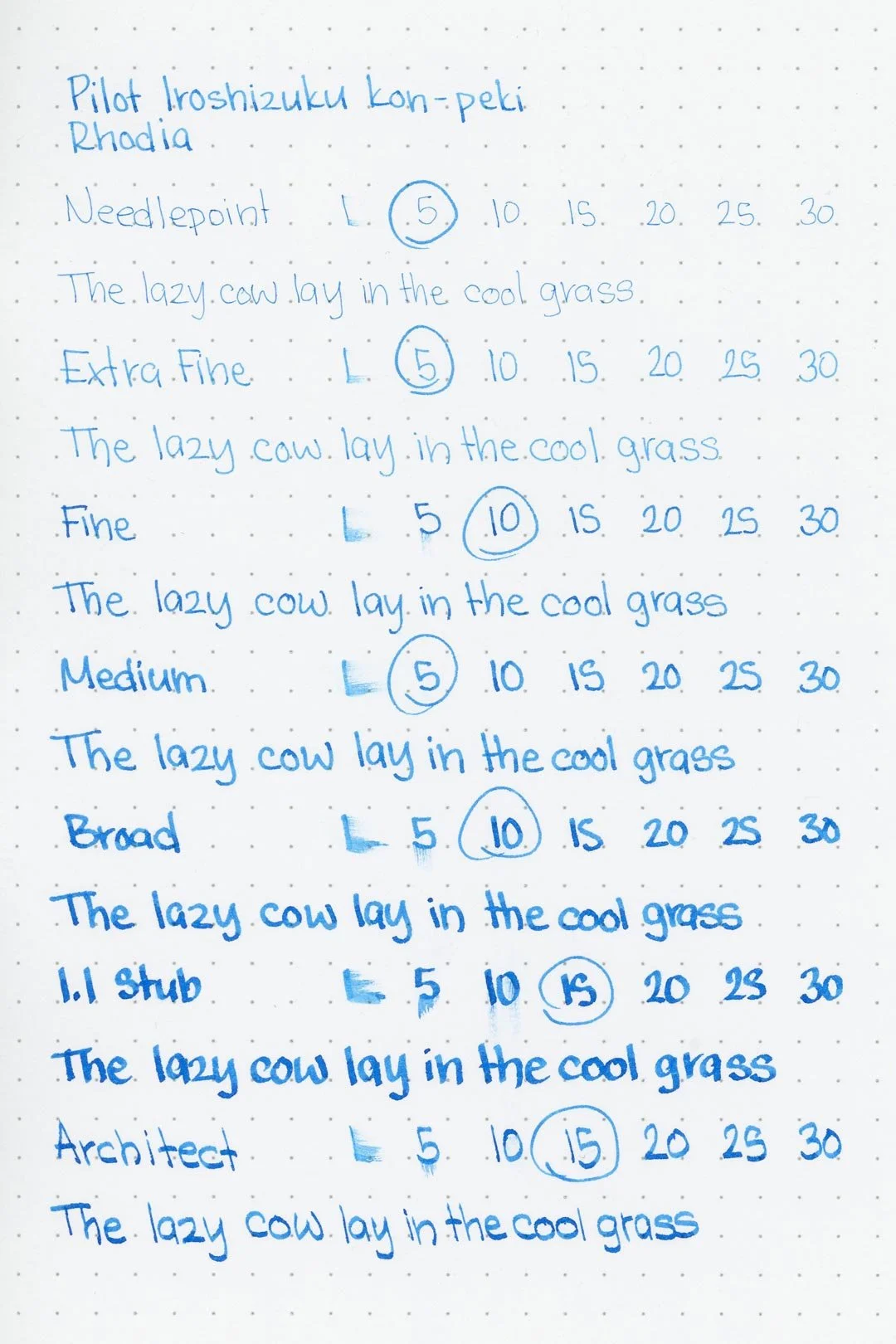
Pilot Iroshizuku Kon-peki is a vibrant, saturated pure-blue. There’s some shading with a soft cut between lighter and deeper tones of the ink, as well as some sheen that you may notice around the edges of shading areas. While there’s not a lot of either sheen or shade, the combination of both against such a vibrant color creates a unique dynamic that makes this ink especially eye-catching, regardless of nib size.
Ink splat
Ink droplets
Rhodia
Leuchtturm1917
Performance on paper:
Kon-peki is well-behaved. There’s the usual light bleed-through on the Kokuyo paper, as well as some light feathering around the ink droplets (on Rhodia). The feathering on the ink droplets would normally indicate that it might be more aggressive on some of the less-ink-resistant papers, but the feathering is so fine that I don’t think it would be an issue unless you’re running this ink through a very wet pen (and at that point, most of the less ink-resistant papers would begin to have issues anyway). There wasn’t any noticeable bleeding or feathering on the other test sheets, so this ink should be just fine in most conditions. The dry times are mostly average, sitting around 15-20 seconds to dry using the larger nib sizes and 5-10 with the finer ones. The water resistance isn’t bad, and what’s left over after water exposure should be mostly legible, but the color clouds when exposed to water, and it may be worse if a very wet nib was used
Midori MD
Maruman
Tomoe River
Kokuyo
Water resistance
Chromatography
Performance in the pen:
Kon-peki has a medium flow, and while it’s not overly slick, it’s certainly lubricated enough for a comfortable and consistent writing experience across all of the nib sizes. I had some minor hard starting with the broad nib if I stopped writing for a few seconds too long, but none of the other nib sizes experienced any issues. Unfortunately, the ink left light blue stains on the inside of the barrel as well as the threads that connect the nib units to the pen that weren’t able to be cleaned with basic water. The pen had to be disassembled and scrubbed out to remove the stains. This shouldn’t be an issue for most pens, but if you have a demonstrator, especially one with an integrated filling system, perhaps this ink isn’t the best choice.
Performance in a pen: 9/10
Performance on paper: 8.510
Color saturation: 7/10
Sheening: 3/10
Shading: 4/10
Dry time: 7.5/10
Water resistance: 3/10
Ease of cleaning: 6/10
Shimmer: None
My personal thoughts…
In my search to find the correct translation for “Kon-peki,” what I landed on most was “Deep Cerulean Blue” or “Bright Blue.” I prefer “Bright Blue.” I think it’s less vague and suits the tone of the ink better, but either translation is appropriate.
Kon-peki has been one of the most popular colors in the Iroshizuku line-up, and it’s not hard to see why. For years, it’s been one of my favorites. I don’t think the hype is unjustified. It’s stunning, especially if you’re used to more basic blues. It’s also versatile — vibrant enough to catch your attention, but not so much that it borders on unprofessional. It doesn't need the biggest nib to get the best out of it, and is equally beautiful with a fine or a double broad. Plus, it’s a blue that’s suitable for all seasons, so you can use it all year round. You would think that amongst so many excellent Iroshizuku inks it would be hard for me to recommend just one, but it’s really not: I would choose Kon-peki.
Written in a Leuchtturm1917 notebook (cursive) and a 68 gsm Tomoe River pocket notebook (Print) with a Sailor Pro Gear (medium nib)
More images/info:
Comparisons:
Tools and materials used in the writing samples:
A TWSBI Diamond 580 AL with 7 nib units including a Needlepoint grind, EF, F, M, B, 1.1mm stub, and an Architect grind. All nibs are tuned to perform at the same medium wetness.
A Rhodia No16 A5 DotPad
A Leuchtturm1917 A5 Notebook
A Midori MD A5 Notebook
A 68gsm A5 Tomoe River Notebook
A Maruman Mnemosyne A5 Spiral Notebook
A Kokuyo Campus A5 Notebook


