Robert Oster Citrus
Ink Review #84

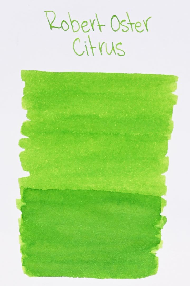
*Please note that the scan is the accurate representation of this color.
Overview
The Color and Properties
Robert Oster Citrus is a vibrant, bright green with light yellow undertones. It also has a high degree of shading: the areas where the ink pools are significantly darker, along with dark, hard edging around any of the shading areas. Something else I started to notice while writing with this ink were slight hints of brown undertones around the lighter parts of the color that give a subtle earthiness to the ink. It’s not distinct, and I second-guessed myself a lot, but I kept seeing it.
Ink Splat
Ink Droplets
Chromatography
Performance on Paper | Dry Times | Water Resistance
There was a light amount of feathering on the Kokuyo paper, but surprisingly, not a lot of bleed-through, which was mostly limited to the largest nib sizes. The other papers didn’t have any bleeding or feathering. This ink should be gentle on most fountain pen-friendly papers.


Rhodia


Leuchtturm1917
The dry times were a hair below average, but still serviceable, mostly drying around 15-20 seconds with the larger nib sizes, although the dry times were noticeably worse on the Leuchtturm paper.
The water resistance is poor, and the color mostly washes away as soon as it’s exposed to water. There are faint traces left behind of the writing, but its legibility isn’t great (if there’s any at all).
More Pages


Performance in the Pen | Cleaning
Citrus has a medium flow that’s mostly consistent across each of the nib sizes. There was a noticeable drop in lubrication with the needlepoint and fine nibs; however, with all of the other nib sizes, the ink flowed well and was very smooth and comfortable to write with. Despite the good flow, I still had a few hard starts with the broad and stub nibs, and it wasn’t all that surprising: the ink seems to dry relatively quickly if the nib is left in the open air. I’ve also found that this ink is prone to heavy nib creep in a short period of time. It’s not the biggest issue, but I would avoid using this ink in a pen that doesn’t have a great cap seal.
Cleaning was quick, and only required a basic soak and flush to run clear.
This is the nib creep that occured while doing the writing sample for this review.
Writing Samples
Performance in a pen: 7.5/10
Performance on paper: 9/10
Color saturation: 7/10
Sheening: 0/10
Shading: 6/10
Dry time: 7/10
Water resistance: 2/10
Ease of cleaning: 9/10
Shimmer: None
My personal thoughts...
Citrus was my first Robert Oster ink and was actually a birthday gift from my girlfriend, who saw how disappointed I was with Diamine Jade, an ink that I bought hoping for a brighter, more refreshing green than anything I currently had. In that respect, it was perfect. It’s fresh and vibrant, but not so much that it compromises its legibility. It was the Spring and Summer Green I was looking for! Bright green isn’t the color I usually have in mind when I think “citrus,” versus lemon yellow, but it’s a nice alternative and more practical for day-to-day writing. And why not? Limes are green, and Robert Oster Citrus is a perfect match.
Written in a Leuchtturm1917 notebook with a Karas Pen Co. INK V2 (Titanium EF)

More images/info:


Comparisons:


Tools and materials used in the writing samples:
A TWSBI Diamond 580 AL with 7 nib units, including a Needlepoint grind, EF, F, M, B, 1.1mm stub, and an Architect grind. All nibs are tuned to perform at the same medium wetness.
A Rhodia No16 A5 DotPad
A Leuchtturm1917 A5 Notebook
A Midori MD A5 Notebook
A 68 gsm A5 Tomoe River Notebook
A Maruman Mnemosyne A5 Spiral Notebook
A Kokuyo Campus A5 Notebook